Skip to content
Elements of Aesthetic Balance in Jewelry
When jewelry looks "just right", it's not by chance. It's the result of careful design that balances key elements: line, shape, texture, and color. These components work together to create visual harmony, ensuring a piece feels stable and intentional. Here's a quick breakdown:
- Lines: Guide the eye and influence movement. Straight lines convey order, while curved lines add softness.
- Shape: Symmetry creates calm and order, while uneven designs bring energy and movement.
- Texture: Adds depth and contrast. Polished surfaces shine, while matte or hammered finishes feel subtle and grounded.
- Color: Combines hues and metals to create contrast or flow. Complementary colors pop, while similar tones feel cohesive.
Each element plays a role in distributing visual weight, ensuring the design feels balanced and complete. Whether you prefer timeless symmetry or modern energy, balance is the key to jewelry that resonates visually and emotionally.
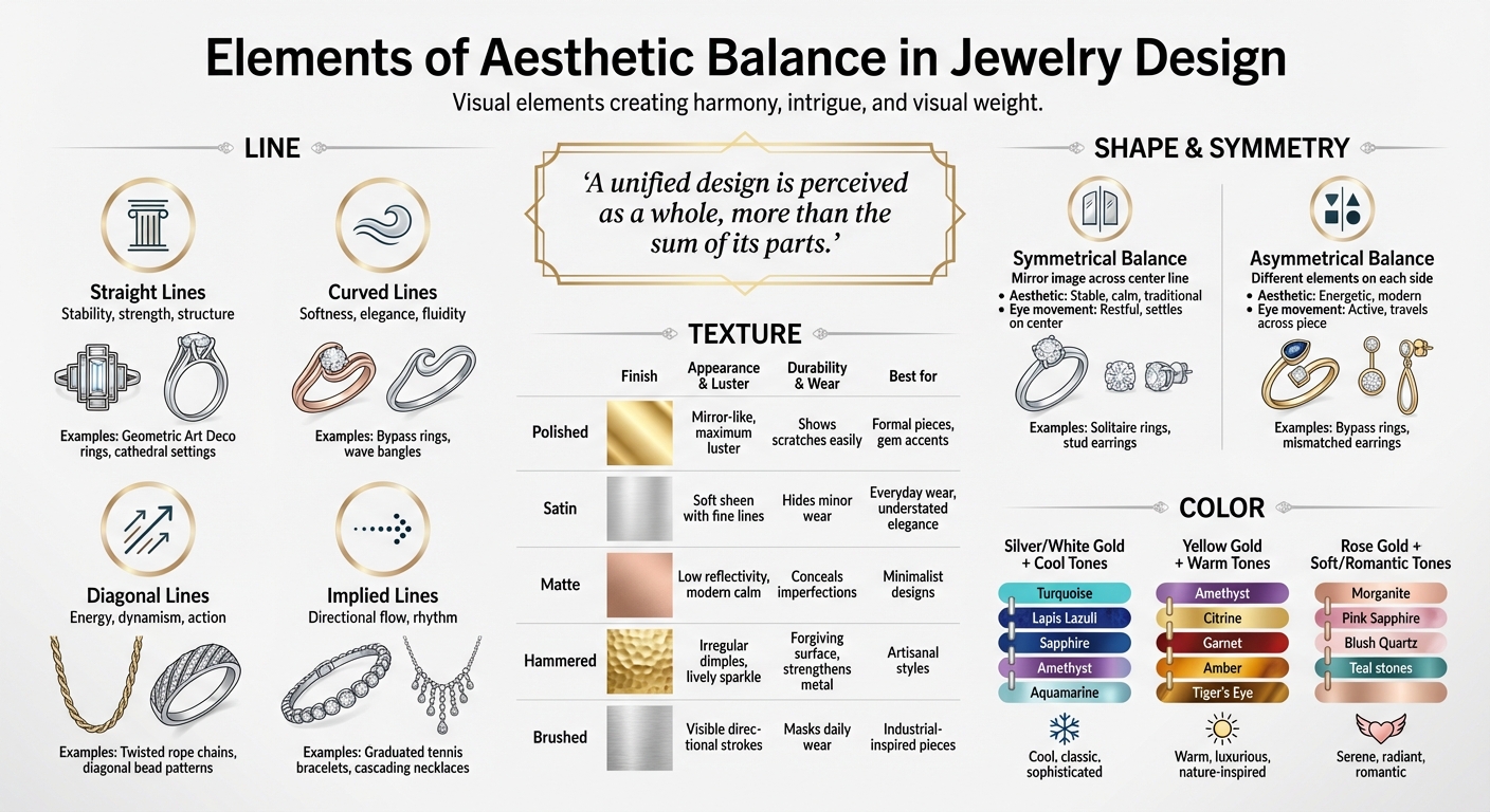
Visual Guide to Aesthetic Balance Elements in Jewelry Design
How Lines Create Balance in Jewelry
Lines are the backbone of jewelry design, shaping how we perceive balance and movement. As jewelry designer Lexi Erickson explains:
"Line draws the eye around the piece. Think about the line of your piece: will it lie gracefully against the body when worn?"
The direction of a line can completely change how a piece feels. Vertical lines, like those in cathedral settings, pull attention upward, giving the design a sense of height. In contrast, horizontal lines, as seen in tennis bracelets, create a smooth, flowing connection along the body. These subtle shifts affect both how the jewelry interacts with the wearer and how its weight is perceived.
Straight Lines vs. Curved Lines
Straight lines bring a sense of order and stability to a design. They’re often featured in geometric and Art Deco jewelry. Picture a square-cut emerald in a bezel setting or the clean, parallel lines of a bar necklace - these designs feel deliberate and grounded.
Curved lines, on the other hand, add movement and softness. They bring an organic, flowing quality to pieces like bypass rings or wave-inspired bangles. These designs feel more fluid and less rigid, offering a completely different energy.
Implied Lines in Design
Implied lines are a clever design tool. They aren’t physically drawn but are suggested through the arrangement of gemstones or patterns, guiding the eye naturally through the piece. Jewelry designer Stephanie J. Eddy describes this concept well:
"Movement... is all about guiding the viewer's eye through your design, creating a dynamic flow that tells a story"
A great example of implied lines is a graduated tennis bracelet. The stones gradually increase in size toward the center, creating an invisible "crescendo" that draws attention to the focal point. Similarly, gemstone shapes like pear or marquise cuts act as visual arrows, directing your gaze along a specific path. Even when there’s space between design elements, repeating patterns can trick the brain into connecting them into a continuous line.
| Line Type | Visual Effect | Jewelry Example |
|---|---|---|
| Straight | Stability, strength, structure | Geometric Art Deco rings, cathedral settings |
| Curved | Softness, elegance, fluidity | Bypass rings, wave bangles, organic forms |
| Diagonal | Energy, dynamism, action | Twisted rope chains, diagonal bead patterns |
| Implied | Directional flow, rhythm | Graduated tennis bracelets, cascading necklaces |
From here, we’ll look at how shape and symmetry work together with lines to create even more balanced designs.
Shape and Symmetry in Jewelry
Shape forms the backbone of jewelry design, influencing whether a piece feels serene or full of energy. The arrangement of shapes - whether perfectly mirrored or intentionally uneven - defines how a piece looks and feels, both visually and when worn.
Symmetry for Formal Balance
Symmetrical designs rely on a mirror-image layout, where elements on one side of a central line match those on the other. This approach, known as formal balance, creates an orderly and stable appearance. Radial symmetry takes it a step further by arranging elements around a central point, like the spokes of a wheel, ensuring an even distribution of visual weight. As Kendra Wollert, CGA at Olufson Designs, explains:
"Symmetrical balance involves arranging elements evenly on either side of a central point, creating a sense of stability and formality."
While symmetry provides a calm and grounded aesthetic, it can sometimes feel overly rigid. Adding a slight asymmetrical touch - like an off-center accent stone or a single textured detail - can introduce subtle intrigue without compromising the overall balance.
Uneven Shapes for Dynamic Balance
Asymmetrical designs break away from predictable patterns, creating a sense of movement and energy. Instead of matching elements on both sides, these designs balance different features. For instance, a large focal gemstone on one side might be offset by a cluster of smaller stones or a textured metal element on the other. The result? Both sides feel equally weighted, even though they’re visually distinct.
This type of balance feels fresh and dynamic. A great example is the ESTABLISH ring from the Layla Kaisi Collection, released in July 2025. It features a GIA-certified Fancy Light Yellow pear-cut diamond set diagonally across the band. An open halo of round and pear-cut white diamonds complements the off-center placement, creating movement while maintaining harmony. As Layla Kaisi Collection puts it:
"Where symmetry soothes, asymmetry excites. It draws the eye, sparks conversation, and reflects the dynamic, multifaceted nature of the modern wearer."
One trend embodying this principle is mismatched earrings. Each earring is unique, yet they share a cohesive material or color theme. Designers often balance these pieces by pairing a larger, matte-finished element with a smaller, brightly colored gemstone. Additionally, incorporating negative space around irregular shapes prevents the design from feeling overcrowded, offering the eye a moment to pause.
| Feature | Symmetrical Balance | Asymmetrical Balance |
|---|---|---|
| Visual Arrangement | Mirror image across a center line | Different elements on each side |
| Aesthetic Feel | Stable, calm, traditional | Energetic, modern |
| Eye Movement | Restful; settles on the center | Active; travels across the piece |
| Common Examples | Solitaire rings, stud earrings | Bypass rings, mismatched earrings |
The interaction between shapes and symmetry lays the groundwork for compelling designs, further enriched by texture and color. Both symmetrical and asymmetrical approaches offer distinct impressions, enhancing the overall harmony of jewelry. Next, we’ll delve into how texture adds depth and balance to jewelry design.
Using Texture for Visual Balance
Texture plays a key role in creating balance and depth in jewelry design, just like line and shape. It influences not only how light interacts with a piece but also how it feels to the touch. For instance, a polished surface reflects light sharply, creating a mirror-like effect, while a hammered or brushed finish scatters light into softer highlights. This contrast adds dimension and intrigue.
Think of texture as a way to control visual intensity. High-polish finishes grab attention with their bold sparkle, while matte, satin, or hammered textures provide a more subdued, grounded appearance. Pairing these contrasts - like a polished bezel with a matte band - guides the eye to the brighter detail while the textured element provides balance and context.
"Texture contrast is one of the most reliable ways to make jewelry - and the outfits it completes - look intentional, dimensional, and modern."
Texture also impacts a piece's durability and maintenance. Polished surfaces, while striking, tend to show every scratch and may need frequent upkeep. In contrast, hammered or brushed finishes are more forgiving, masking wear and even strengthening the metal through work-hardening. Next, let’s dive into the art of combining textures for cohesive designs.
Combining Different Textures
Mixing textures effectively requires thoughtful choices and a clear hierarchy. Start with a dominant finish - like a bold hammered cuff - and complement it with one or two subtler textures, such as polished edges or a satin rim. Avoid overloading with too many textures, especially near the face, where light naturally draws attention.
Combining raw, unpolished gemstones with faceted cuts is another way to create contrast. A rough crystal or druzy surface offers a soft, natural shimmer, while faceted stones bring sharp brilliance and fire. Together, they highlight the beauty of nature’s irregularities alongside the precision of human craftsmanship. At LaCkore Couture, thoughtful texture combinations not only enhance visual appeal but also improve durability. For everyday wear, brushed or matte finishes pair beautifully with glossy fabrics or makeup, creating a balanced, polished look while concealing minor wear.
| Finish Type | Visual Effect | Maintenance/Wear | Best Application |
|---|---|---|---|
| Polished | Mirror-like, maximum luster | Shows scratches easily; needs repolishing | Formal pieces; accents near sparkling gems |
| Satin | Soft sheen with fine lines | Hides minor wear well | Everyday wear; understated elegance |
| Matte | Low reflectivity, modern calm | Conceals imperfections effectively | Minimalist designs; contrasts with gem sparkle |
| Hammered | Irregular dimples; lively sparkle | Forgiving surface; strengthens metal | Artisanal styles; mixed-texture collections |
| Brushed | Visible directional strokes | Masks daily wear | Industrial-inspired pieces; smooth gem accents |
Color Harmony in Jewelry
Color is one of the most powerful tools in jewelry design. The right combinations create a sense of balance and intention, while mismatched choices can disrupt the flow of a piece. Unlike texture or line, color works through the interaction of hues and the metals that frame them.
Color harmony often relies on two main approaches: complementary and analogous color schemes. Complementary colors sit opposite each other on the color wheel - think blue with orange or red with green. These combinations create high contrast, making each hue stand out. On the other hand, analogous colors - those next to each other on the wheel, such as turquoise, aqua, and teal - offer a softer, more cohesive look often described by designers as having "editorial softness".
The secret to using complementary colors effectively is to avoid visual conflict. Jewelry designer Cathryn Jakicic explains:
"If each color carries the same weight in the design, the pop is a bit too loud. To me, equal complementary colors create a visual tussle that doesn't allow either color to really shine – and doesn't allow the eye to rest".
Instead, one color should take the lead, with the other serving as an accent. For instance, a vivid purple sapphire set in yellow gold uses the metal's muted tone to create a striking yet balanced contrast.
Complementary and Analogous Colors
Complementary schemes thrive on contrast, creating balance through opposing hues. When handled carefully, this tension feels harmonious. For example, pairing peridot with red garnet brings festive energy, while aquamarine matched with topaz delivers a dynamic yet polished look. In contrast, analogous schemes rely on colors that naturally flow together. Combinations like pink tourmaline with ruby or a golden orange sapphire with yellow create a warm, unified feel, perfect for layered pieces or stacks that demand smooth transitions.
Pairing Metals with Gemstones
Metals play a pivotal role in framing gemstones, enhancing their colors and overall impact. Yellow gold complements greens and browns beautifully, while white gold or platinum highlights cooler tones like blue and purple, adding depth and elegance. Rose gold, with its warm pink undertones, pairs effortlessly with pink stones like morganite or pink tourmaline, creating a refined, monochromatic effect.
Classic pairings demonstrate these principles in action. Gold with turquoise is an enduring choice, as the warm metal enhances the cool, blue-green hue of the stone. Similarly, silver paired with amethyst offers a clean, modern "cool-on-cool" aesthetic. Rose gold with peridot provides a complementary contrast, amplifying the green stone's natural vibrancy. At LaCkore Couture, these thoughtful combinations ensure every piece feels intentional, whether you're drawn to bold contrasts or smooth, flowing harmony.
| Metal Type | Recommended Gemstone Pairings | Visual Effect |
|---|---|---|
| Silver / White Gold | Turquoise, Lapis Lazuli, Sapphire, Amethyst, Aquamarine | Cool, classic, sophisticated |
| Yellow Gold | Amethyst, Citrine, Garnet, Amber, Tiger's Eye | Warm, luxurious, nature-inspired |
| Rose Gold | Morganite, Pink Sapphire, Blush Quartz, Teal, Navy stones | Serene, radiant, romantic |
Next, we’ll dive into how these color strategies work alongside shape and balance to create cohesive designs.
Combining Elements for Balanced Design
Balanced design brings together line, shape, texture, and color into a unified whole. When these elements align, they create a sense of stability. When they don’t, the result can feel chaotic and disjointed.
Visual weight plays a critical role in this process. Factors like size, color intensity, texture, and negative space all contribute to how elements are perceived. For instance, a small, brilliant-cut diamond with high sparkle can command as much attention as a larger, matte-finished stone. This principle allows designers to craft pieces that feel harmonious, whether they follow traditional symmetry or embrace a more modern, uneven approach.
One guiding principle for balance is:
"Contrast should highlight your focal point, not compete with it".
Contrasting elements, like mixing textures or pairing metals such as yellow gold and white gold, can add depth. However, it’s essential to limit these contrasts to just two or three elements to maintain harmony. A two-tone bridge piece, for example, can tie mixed metals together, ensuring the combination feels deliberate rather than random.
Harmony is achieved through repetition and continuity. Repeating shapes, colors, or textures creates rhythm, making the design feel cohesive rather than like a collection of unrelated parts. Jewelry designer Stephanie J. Eddy explains it perfectly:
"A unified design is perceived as a whole, more than the sum of its parts".
By carefully distributing visual weight, designers can create a solid foundation for exploring how different types of balance influence a piece’s overall personality.
Symmetrical vs. Uneven Balance
Choosing between symmetrical and asymmetrical balance further refines a design’s overall harmony. While earlier sections discussed how symmetry and asymmetry affect individual elements, combining all design aspects shows how each approach shapes a piece’s character.
| Balance Type | Pros | Cons |
|---|---|---|
| Symmetrical | Stable, timeless, and classic; conveys order and formal elegance | Can feel predictable or static if overused |
| Asymmetrical | Dynamic, modern, and visually engaging; suggests motion and energy | Requires skill to balance effectively and avoid a lopsided appearance |
Neither approach is inherently better - it all depends on the desired mood. Symmetrical designs work well for formal styles or pieces meant to convey timelessness and permanence. On the other hand, asymmetrical designs bring energy and movement, making them perfect for bold, contemporary statement pieces. The trick with asymmetry is ensuring all elements carry equal visual weight, so the design feels intentional and complete rather than unbalanced.
LaCkore Couture: Examples of Aesthetic Balance
LaCkore Couture's handcrafted jewelry collections are a masterclass in how line, shape, texture, and color come together to create visually harmonious designs. Made in the USA, each piece reflects the thoughtful use of these elements to achieve a cohesive aesthetic.
Take the Dapper Dapple Stack, for instance. This design layers jasper, 18k gold hematite, obsidian, and howlite stones to create a striking yet balanced look. The smooth finish of the metals contrasts beautifully with the textured natural stones, offering visual interest without overwhelming the design.
When it comes to necklace layering, LaCkore Couture employs the Rule of Three, which involves placing a bold statement piece between two simpler ones. As they explain:
"Varying lengths will help achieve a cascade of layers, so it doesn't look like you just stacked your necklaces on at random".
For example, the Heart Throb Necklace (starting at $97) and the Pretty Little Thing Necklace (starting at $35) are often paired with bar necklaces. These bar necklaces act as subtle connectors between shorter and longer pieces, creating a seamless layered effect [25,26].
The Crystal Love Lock Charm Bracelet ($46) highlights symmetrical balance. LaCkore Couture emphasizes the importance of harmony between the bracelet and its charms:
"We believe that charms and bracelets are a symbiotic relationship. That's why we put just as much effort into the charms as we do the bracelets".
This equal focus ensures that each bracelet is cohesive and visually appealing.
For ring stacking, the brand recommends placing a band with a central stone between simpler bands to create a focal point. This philosophy aligns with their broader design approach:
"One statement necklace will ensure that all of the other pieces of jewelry aren't fighting for attention".
Conclusion
From earlier discussions on line, shape, texture, and color, it’s clear that every detail in a design plays a role in achieving balance. In jewelry, this balance emerges when these elements come together seamlessly, each adding its own voice to create intentional, cohesive designs.
Jewelry artist Stephanie J. Eddy captures this idea beautifully:
"Unity in design is the feeling of completeness and harmony. A unified design is perceived as a whole, more than the sum of its parts."
By distributing visual weight evenly, no single element overpowers the others. The use of focal points, repeating motifs, and well-placed negative space ensures harmony while maintaining wearability. Whether you’re drawn to the refined symmetry of classic designs or the lively energy of asymmetry, the ultimate goal is the same: to craft jewelry that connects both visually and emotionally.
A great example of this philosophy is LaCkore Couture's handcrafted collections, which demonstrate how thoughtful design can achieve both aesthetic and emotional resonance. Their pieces, featuring textured layers and cascading necklace lengths, showcase a dedication to detail and artistry - all proudly made in the USA.
FAQs
How can I tell if a jewelry design feels balanced on my body?
To determine if a jewelry design feels balanced, focus on its visual weight and how it aligns with your proportions. Pay attention to elements like size, color, and texture, ensuring they're distributed evenly. For instance, if you choose a bold necklace, opt for understated earrings to keep the look cohesive. A well-balanced design feels natural, highlights your features, and ensures no piece dominates or clashes with your outfit.
What’s an easy way to make asymmetrical jewelry look intentional?
To make asymmetrical jewelry feel purposeful, aim for visual balance. It's similar to styling an asymmetrical haircut or recognizing the beauty in the natural unevenness of a person's face. The key is to ensure the design flows well by balancing features such as size, shape, or color throughout the piece, creating a sense of harmony.
How do I choose metal and gemstone colors that won’t clash?
When pairing jewelry, match cool metals like silver with stones in cooler shades, such as turquoise or lapis lazuli. For warm metals like gold, choose stones with warm hues, like amber or citrine. This approach ensures the colors work together harmoniously rather than clashing.